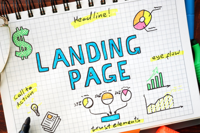
Whether people find your landing pages by searching for specific content or they click through from your paid advertising, your pages need to accomplish one very specific goal.Above all else, they have to grab a visitor’s attention immediately. Depending on who you listen to, you could have only 15 seconds, 7-8 seconds, or even as little as 4 seconds to make an impression that causes visitors to stay and look instead of navigating away.
In order to make common conversions like lead generation or sales, you have to keep visitors on your landing page (or convince them to navigate further into your site) for more than just a few measly seconds. How can you build landing pages that not only achieve this goal, but lead to additional conversions? There are a few elements that can help ensure success.
1. Relevant Content
Content should be your top priority. Attractive, custom website design is essential, of course.You’ll also definitely need premium SEO services to bring in targeted traffic in the first place.However, if the information on ads and search results doesn’t match the content on your pages, you’ve not only lost your opportunity to impress visitors, but you’ve probably upset them by wasting their time.
Google, of course, has cracked down on this very occurrence in recent years. After all, they look like idiots promoting content that doesn’t match what users are searching for. In order for Google to keep its users happy, they have to make sure businesses are delivering what they promise in terms of relevant content. Hence the death of keyword stuffing.
What is relevant content? It’s headlines and copy (or other forms of content) that precisely match the title and description in ads or search results. You can definitely hook a targeted audience and garner click-throughs with specific keywords and phrases.However, you better deliver with relevant content in exchange for their willingness to give you a try.
2. Images and Videos
The internet is a visual medium. You know what’s not very attractive visually? A veritable wall of text. In fact, there’s almost nothing more intimidating or repellent to busy internet users then large blocks of texts.
Imagery, including photos and graphics, can convey important information before visitors read a single word.This helps them realize they’ve come to the right place. Videos are even better. Not only do videos immediately give the impression of entertainment and ease of use, but our brains process information 60,000 times faster when it is delivered in video format (as opposed to text), according to HubSpot.
There are so many ways you can use images and videos on your landing pages.These elements can reinforce relevance and impart information.It’s almost unthinkable to forego the utilization of at least one of these visual tools on every landing page.
3. Customer Reviews
If your landing pages also happen to be product pages, you should include not only product photos and information, but also positive customer reviews. Peer reviews can have a significant impact on consumer buying decisions and you want to take full advantage.
You’ll want to share when happy customers wax poetic about your products and services and highlight the features that are important to them.Plus, there’s a good chance new customers will not only view your brand in a favorable light, but they’ll also relate to the experiences of those who have purchased your products before.
4. Live Chat Feature
Visitors have questions. Will you answer them now or allow prospective customers to search elsewhere, perhaps on competitor websites? Live chat features ensure that you’re able to answer questions post haste, as well as engineer engaging, personal interactions with prospective customers.
5. Proper Design
SEO and marketing services are a crucial component when it comes to increasing visibility and getting found online. Once consumers reach your landing pages, however, your layout and design must compel them to stay.
In the art and design world, there is a concept known as the golden ratio that centers on crafting an image that is optimally appealing to the human eye. You can adopt a similar approach to the layout and design of your website.
Your landing pages could meet a gold standard when you create an attractive visual layout that features a balance of graphics, text, and white space. What you want to avoid is visual clutter than viewers find psychologically displeasing.
You should also strive for intuitive navigation that meets common standards so that visitors are not confused about how to find their way to additional pages. Finally, a prominent call to action lets visitors know how to close the deal.

