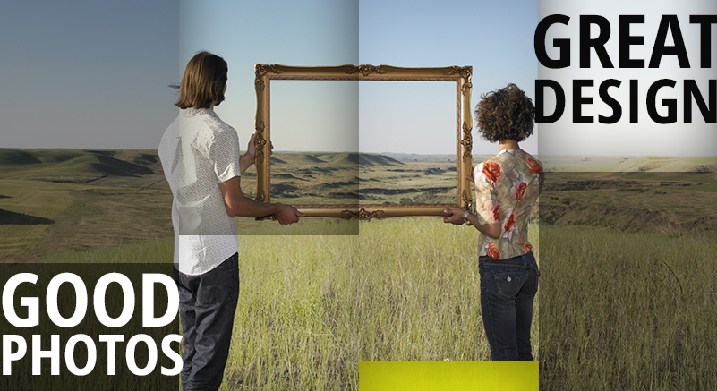
The right photo takes a good design, and makes it stunning. Sometimes the right photo is the solution to the “Something is missing” problem.
Here is a list of things to look for that make a good photo:
- Contrast – Contrast is the number one thing that attracts the human eye. However, usability comes first, so make sure that the photo you integrate into your design has the right kind of contrast. That means dark background with light text and light backgrounds with dark texts. In web design you are always putting text, buttons, or other design elements on top of images, and there is nothing worse than text you can barely read. Using a very subtle drop shadow can sometimes be acceptable.
- Relevance – The picture has to have something to do with whatever you’re selling or doing on your website. For example, for a restaurant you’ll want to use photos of the actual business, or your actual food. Bad stock photos will not do you any good, ever. When you’re website content is a little less tangible than a restaurant, like a corporate office for example, you can get away with using photos that are more symbolically relevant.
- Eye catching– Photos can break up the visual boringness of a site (full of text), and help users to identify an article, link, story, or what-have-you that they might be interested in. If you remember anything from this article, remember this: pictures make people stop and pay attention. This seems almost a little obvious if you think about it but bigger images will have a bigger visual impact.
All of the above are key things to watch out for and why good photos make a design great.
Do you have any other good information regarding photos and design? We’d love to hear them in the comments below.

