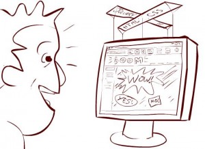
Let’s talk for a second about web design. Specifically, the phrase “design” and how it relates to solid code and the difference between a website that feels really professional, and one that looks nice, but feels awkward.
So what is “design”? Let’s look it up.
“Design: to plan and fashion the form and structure of an object, work of art, decorative scheme, etc.”
There’s more to design than just how it looks and feels. There’s the materials used to build it – in the case of a website, it’s the code.
No matter how solid and flawless your layout of ideas and shapes is, it all falls apart if your coding is bad. Slow or buggy code is problematic in that it does much more than waste the user’s time and your server resources: it ruins the experience and brings attention to itself.
Good code is, in fact, code you don’t see at all.
Let’s think about this for a second. The hallmark of a “good” website, assuming the look is solid, is that it operates as smoothly and seamlessly as a desktop app – perhaps even more so. Every spinning wheel you see, every loading bar, every grey box where an image should be, every paragraph thrown out of alignment because of unloaded elements, immediately breaks the user’s experience and reminds them that they’re looking at a (sigh…) website, and that it must load.
It’s absolutely critical that any website wishing to look its best is coded using the latest, cutting-edge tools and methods. Technology is accelerating quickly, and it’s very exciting for a designer such as myself to know that, soon, browser rendering will support user interfaces that rival Flash and Silverlight, but that’s assuming people know their code.
So ironically, those concerned with looks such as myself must become every more savvy with technology. These are interesting and exciting times indeed.
—————————-
Tom Murray is a developer at Studio98.He makes stuff look good and work good.

